


_____
Branding & Print
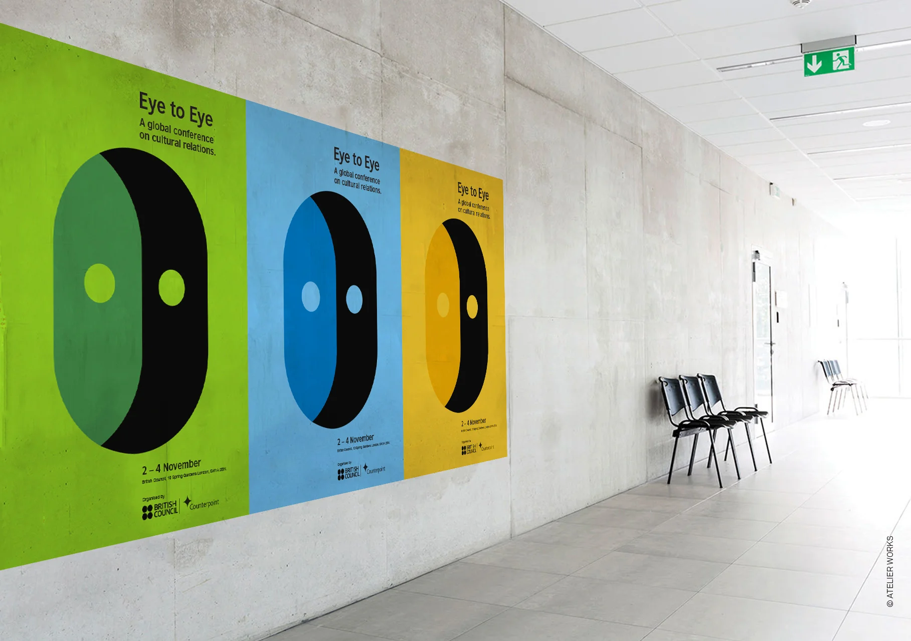
Eye to Eye was a conference that brought people together from all over the world who were concerned with cultural relations. It was the first event of its kind and the beginning of a journey to seed a global constituency of people who see an understanding of cultures – the way they work, interact and communicate, as vital to all our futures.
The symbol represents two people sharing a view, literally coming eye to eye. The overprinting effect, was translated into three key colour-ways, used across key touchpoints. The symbol was also simplified and paired with rough hand-drawn illustrations which contrasts with the graphic mark. This was used to visually annotate a series of books produced for the conference. Eye to Eye featured in Design Week and also in The Creative Review Annual, showcasing the best work of the year.