Fitzsimons Fishmongers
_____
Branding, Signage & Environmental Design
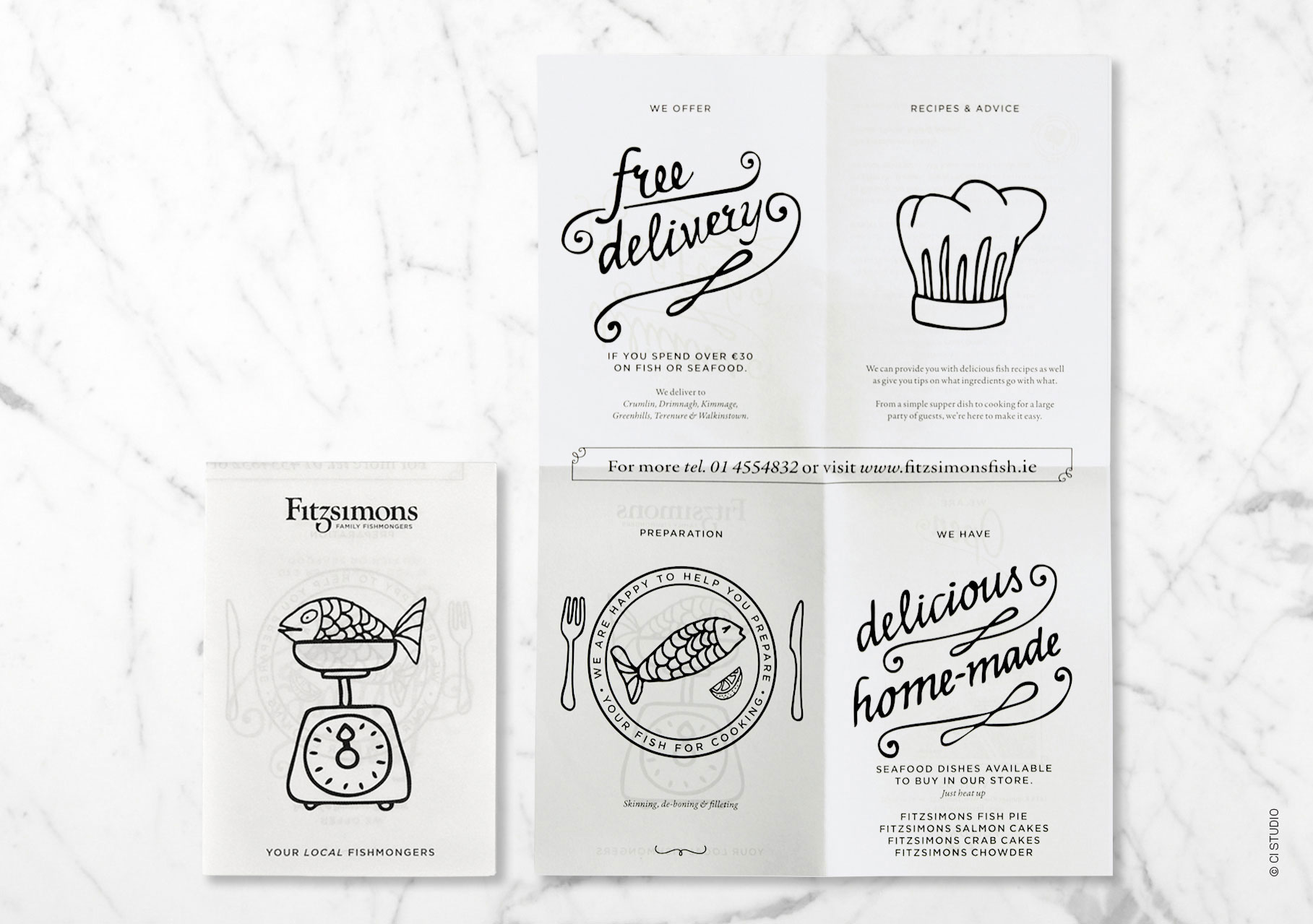
This family fishmongers needed to increase visibility and broaden their customer base. A traditional mark with a nod to a fish tail was created and paired with playful fish illustrations and wry copy, to create a memorable brand. The brand execution was in black and white, to reference the time old tradition, of wrapping fish in newsprint. This monochromatic scheme worked well to deliver print items within budget.
The result was the creation of brand with a traditional, friendly, yet sophisticated feel to appeal to new customers and not alienate existing customers. The brand came to life through a retrofit of the store, signage, environmental graphics, livery, print and packaging.


